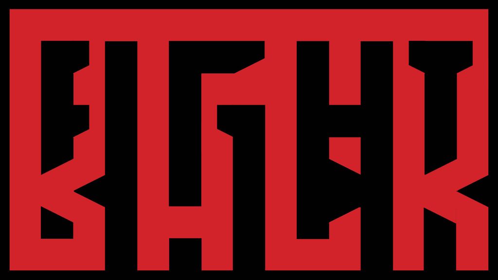
The banner reads “Fight Back”
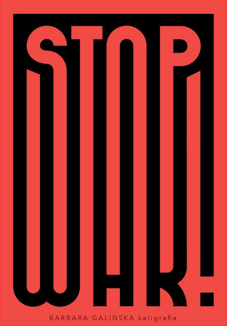
A while ago, I came across a poster that managed to catch my attention like few others had before. It was titled Stop War and was created by the talented calligrapher Barbara Galinska. The poster uses bold typography to connect the bottom ends of the word “STOP” to the top of the word “WAR!” in a unique way. The creative use of typography, combined with its striking message, inspired me to create a design based on it.
I decided to connect the words “FIGHT BACK” in a similar way to how the original poster connects “STOP WAR.” However, I chose to use a landscape format to differentiate my design from the original. The letters also feature sharp corners compared to the poster’s rounded segments. I kept the red and black color palette because it’s ultimately the most striking combination. The word “FIGHT” can be seen through the black background surrounding the word “BACK” in red. These two words complement each other perfectly, since its difficult to find words that work together similarly like “STOP WAR!”
I’m really proud of coming up with this concept on my own and with how the final banner turned out. I would like to improve the letters “F” and “T” in “FIGHT,” but I think it still holds up otherwise.